Much ado about exponentials
So much talk about exponentials, so little understanding of growth processes

Growth processes may look exponential early on, but that tells us very little about how far they'll go in the long term.
This post was inspired by a number of discussions with people about exponential growth (in product adoption, economies, and epidemics), and this tweet:


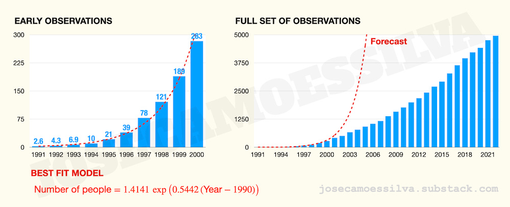
If we just look at the data until 2001, the process is clearly convex, which many people call —incorrectly— exponential.1
There are many examples of processes that look exponential in the beginning, and sometimes we can do funny things with that:


But in other cases “exponential growth” is used to scare people with the potential dangers of a deadly disease, or to convince investors they’ll miss a fortune if they pass on the new new thing; the world has enough fear and greed already, so let’s be on the lookout for people misusing mathematical models to increase either.2
Many “exponentials” are just the early part of an S-shaped curve
We can load Massimo’s data into a spreadsheet (or RStudio) and find the best-fit exponential for that data;3 then we can plot the data and the forecasted growth:
Forecasts are difficult, especially for the future; but much more so when using an exponential model calibrated on early data to forecast what almost certainly will at some point become an S-shaped curve.
(Exponential growth is very unlikely in real-world systems, because at some point the growth process begins to run out of resources. Exponential decay, on the other hand is a pretty good approximation of many real-world processes.)
This post elaborates on an old post and on material covered in my book (the chapter on the pandemic; get your free sample here, that chapter is in the paid part, though).
We can’t forecast long-term behavior from early data
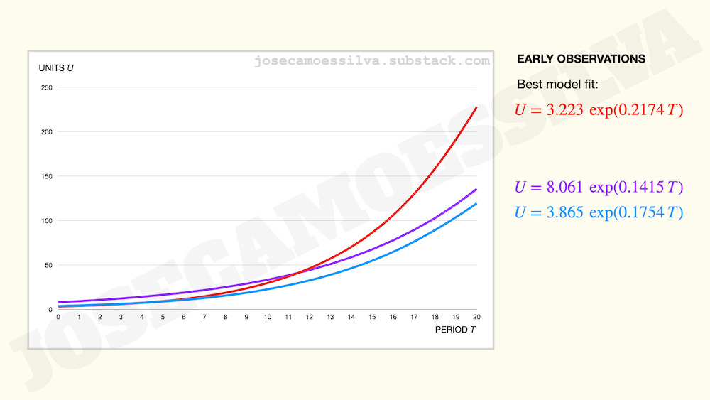
To make the point more salient and see the wrong conclusions we draw from early data, let us consider the case of three new products: red, purple, and blue.
Early data and models fit to it suggest that the red product has the best potential (look at that growth rate!), followed by slow-starter blue, which despite the slow start is growing just a bit faster than purple:
Now let us look at the full life cycle, which we can do because we’re in God-mode (the technical term for “God-mode” is “using simulated data”):
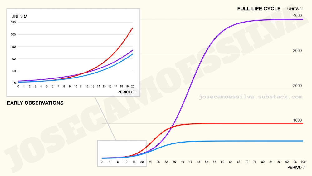
Early data can’t tell us the most important long-term characteristic: the size of the market for the product.
Mostly because to fit an S-shaped curve to data, we need to get data past the inflection point (where the curve goes from convex —growing faster and faster— to concave —growing slower and slower. And even small errors in data near that inflection point lead to large errors in the estimate of the asymptote (the height of the flat part), which here is the size of the market.
Furthermore, as the image shows, there’s no relationship between the ranking of the products in the early data (red > blue > purple) and in the full life cycle (purple > red > blue).
And note that we used 20 periods for the early observations, which is close to half the life cycle of two products (red and blue) and one-quarter of the purple’s. That’s a lot more data points than decision-makers usually use to make these decisions.4
As Charles Eppes in Numb3rs tells a person who says a problem is ‘exponential’: “Exponential means that the growth is proportional to the size; the technical term for what you want to say is ‘bigger’.”
For trust-but-verify types (which we should all be) and to put the error of using exponentials in context, these are the simulation models used to generate the data:

The “clearly” part isn’t just from visual inspection: if we compute the second-order difference (the difference between consecutive differences of values for consecutive years), 2002 is the first year when that’s negative, thus showing that the rate of growth slowed down between 2000 and 2002. From then on there are some positive and negative second-order differences, and past 2009 they are overwhelmingly negative, indicating the process is past the inflection point.
At the beginning of the pandemic, persons who couldn’t pass 7th-grade math were repeating “exponential growth” like parrots, which was one of the driving factors for my writing a book. (Get your free sample here.) Many of these people moved on from their nonsensical math within months, without acknowledging their error or that the actions they supported had non-trivial consequences for others.
To estimate the parameters of an exponential process, Y = a × exp( b × X), we can use ordinary least squares (“linear regression”) by making a change of variable Z = log(Y). Some spreadsheets have a model fit function as a part of data plots, but isn’t it better to know what we’re doing?
To be fair, these would be reduced-form models. Decision makers, at least knowledgeable ones, would use data about the fundamentals of the market and the internal parameters of the adoption process to estimate life cycle potential. Just like epidemiologists can use individual health data and models of network topologies to estimate effects, not just aggregate infection numbers and variations on susceptible-infected-recovered/removed.