

Decisions based on data... like PhD programs make students insane?
They might, they might not; but the chart circulating on twitter illustrates how different people can each have their own reality.

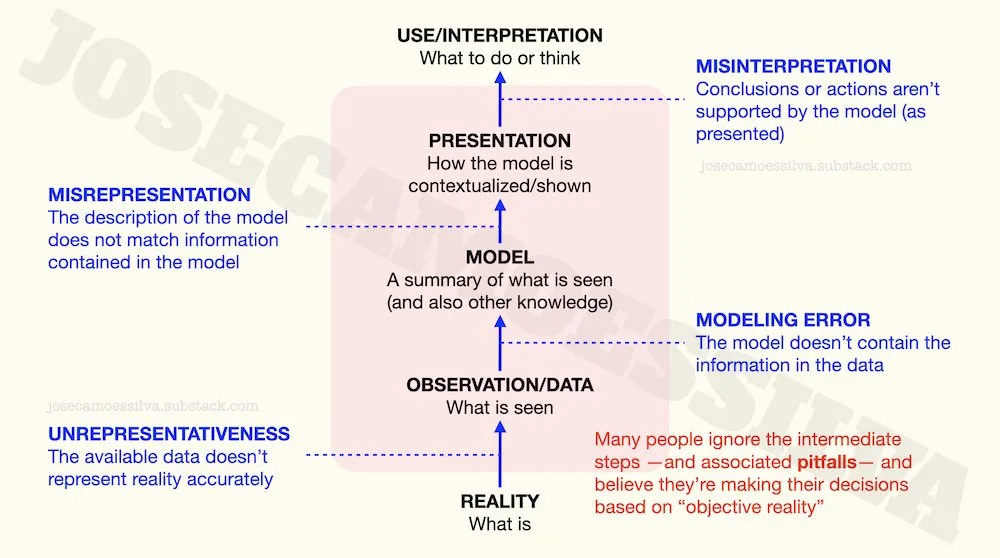
People who believe their decisions are based on reality often don’t realize how much has to go right for that belief to be accurate.
Here’s an illustration of the error-prone steps between the actual reality and our actions and thoughts “based on reality”:
(I wrote a book about [the numerical parts of] this: free sample here, some details here.)
First class of problems: the data doesn’t represent reality accurately.
Starting at the bottom, a common way for data to be a misrepresentation of a phenomenon of interest is the use of proxies, i.e. variables that aren’t exactly what we’re interested in but are “related” and available.
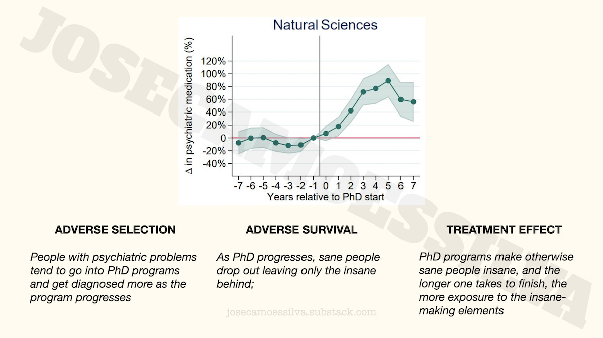
For example, this chart has been making the rounds of the intertubes
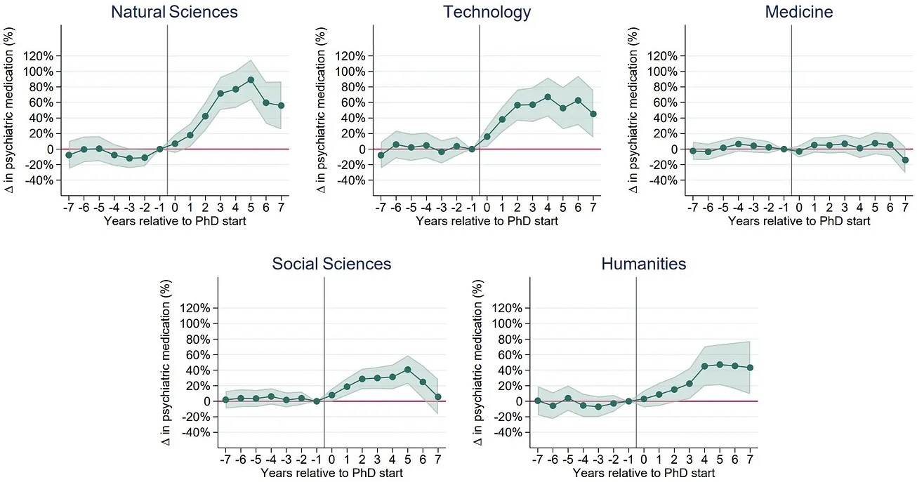
as evidence that being in a PhD program is bad for one’s sanity.1
But if we look carefully — or at all — this is not a chart of sanity measurements, but rather a chart of medical prescriptions.
Between insanity and prescriptions are several factors: access to medical services, self-awareness that one needs to see a doctor, ability to have the doctor prescribe the good stuff instead of whatever Big Pharma is promoting this quarter, and others.
We can illustrate the effect of these factors by comparing normies, PhD students, and the twitter geniuses in their parents’ basements explaining to Caltech physicists how superstring theory is an international Communist conspiracy to sap and impurity our precious bodily fluids.
We’ll use just one factor, combining access [to medical services] and persuasion [that one should be given psychiatric medication].
If the PhD students have the same incidence of insanity as the normies, but have higher levels of access (PhD students are in universities, many of which have teaching hospitals or access to good healthcare) and persuasiveness, we can see from the chart below that that unobserved factor itself creates the illusion that PhD students are more insane than the normies.2
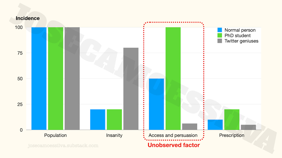
(As a PhD program progresses, students learn to be more persuasive, which would explain the dynamics in the data. But the point here is just that we have to be careful when there are these factors between the quantity of interest and the proxies used.)
The case of the twitter geniuses is left as an exercise to the reader.
Another common way for data to not represent reality is when the sample used to collect that is unrepresentative of the population of interest. There are two chapters in my numbers book about non-representative sampling (pitfalls 2 and 3), for interested readers. (Free sample here; those chapters aren’t in the free sample.)
Second class of problems: the model doesn’t capture the information in the data
By model here we mean any tool or technique used to extract the information in the data and integrate it with previous knowledge; in many cases that requires statistics.
A common problem with subject matter experts who don’t consult statistics experts when analyzing data is their blind following of procedures after violating the conditions for using that procedure.
Often, when these subject matter (but not statistics) experts need to test a construct that involves multiple variables, they create some a combined index and then assume that the result can be “tested” (may Bayes forgive them) with “the standard method.”
(A previous post illustrating some pitfalls of these “standard methods.”)
This appears to be the case with the PhD/insanity data: what’s reported is a “delta,” not the metric (indirect and potentially wrong as it is) that they collected (number of prescriptions).
From the y-axis scale and some of the text in the tweets we can see that the researchers used a ratio (a centered ratio, meaning that they subtract 1 so that it’s 0 when both values are equal) as their variable of interest.
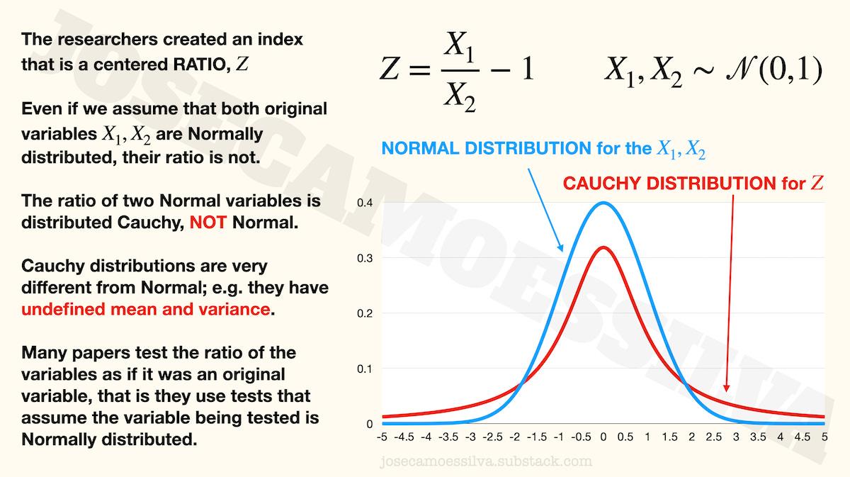
Most statistical techniques in common use are based on the assumption that the variables being tested (may Bayes forgive them) are measured with an error that is Normally distributed with mean zero and unknown variance.
But when the researchers computed their variable of interest — that “delta” in their charts, which is called Z in the formulas above — they used a ratio, and a ratio of Normal variables isn’t distributed Normal, it’s distributed Cauchy.
Cauchy is a distribution that has undefined mean and variance, yet some researchers would use (I didn’t read the paper, as per first footnote) the indices for testing as if they too were Normal variables. Those tests depend on using the sample to estimate the mean and variance of the underlying variable — a variable whose distribution has undefined mean and variance.
That’s just one of the many ways in which models fail to represent reality, and it’s so common that most people who aren’t statisticians (and many who are, including a few professors) make it all the time.
(Typically, the shaded bands around the center line in graphs like the ones in the PhD/insanity chart represent some sort of confidence interval, which is calculated using those same mean and variance that aren’t determined for the Cauchy distribution; so that is indicative that the paper made the common mistake.)
I wrote a book about data modeling: free sample here; post with some details here.
Third class of problems: the presentation doesn’t match the model information
Obviously there are plenty of cases when media reports on scientific and technical advances are incorrect, sometimes in the opposite direction of what the advance actually is.
And many journalists, popularizers, and influencers have no way to judge what’s important or new about a result (or what the result means tout court) in a technical field due to adverse selection in reporting (as explained in this previous post).
Another, less obvious, communication failure (sometimes deliberate) is to force one specific interpretation on technical results that support several others. (Editorializing.) We can illustrate this with the PhD/insanity results.
If we take the results of the model as given and the metric as representative (meaning, if the previous two classes of problems in this post hadn’t happened), what these results say is that insanity increases with the time spent in the program for a few years then decreases; this is most visible for the natural sciences.
This dynamic was presented by many on Twitter as evidence that doctoral programs make their students insane, a treatment effect: students aren’t insane as they go into the program, but as the program progresses they become more and more insane.
That’s one story that is supported by the data, but here are two more:
Note that all three stories accept the model results as correct, but posit different causality for where the results come from:
In the adverse selection case, the reason for increasing insanity (recall that we’re assuming away any metric and modeling problems) is that it takes time to diagnose the insanity that was the reason to go into the program.
In the adverse survival case, both sane and insane people join the program, but the sane ones eventually realize they would be better off somewhere (anywhere!) else; as sane people have different tolerance for stress, some leave earlier, some later, while all the insane stay, hence the increasing trend.
Fourth class of problems: the interpretation doesn’t follow from the results as presented
Even when the information presented is valid, people often fail to interpret it correctly as they lack the appropriate knowledge (especially broad context) in which to place that information; or even if they have that knowledge, it’s not operational in the sense that it’s not invoked when it would help avoid errors.
One of the PhD/insanity results people lock on to is the lack of effect for Medicine.
Some people take that to be causal: getting a PhD in Medicine stops PhD students from getting [more] insane. People who see MDs positively suggest that their medical training and exposure to life-and-death situations make them more resilient to the pressures of a PhD program; people who see MDs negatively suggest that the baseline was already high, i.e. that they were already reached their maximum insanity level during the MD program, so there’s nowhere for it to go up during the PhD program.
Both of these explanations assume that the level of insanity doesn't change in medicine PhDs; but an alternative explanation is that Medicine PhDs have access to the medication without needing a prescription, by “Doctor House”-ing what they need, say prescribing it to patients in a coma (among other techniques):
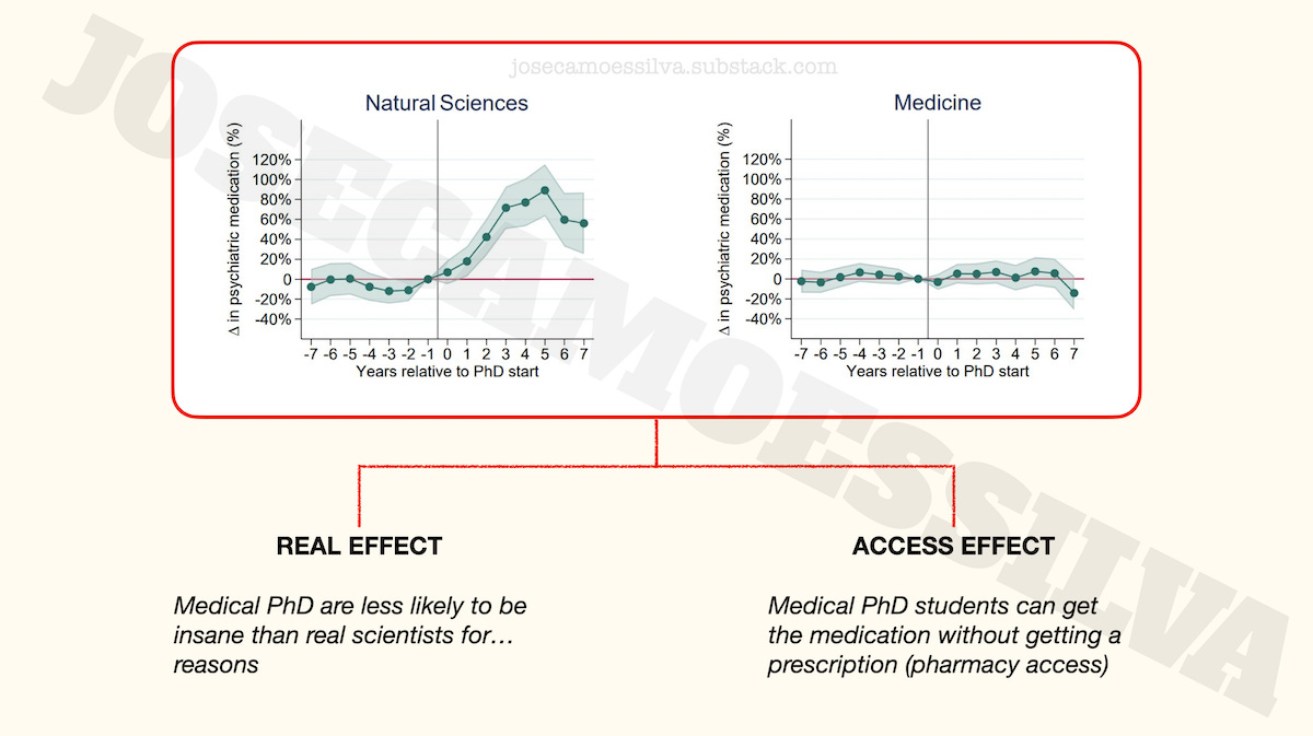
Taking this to be a real effect might influence someone’s decision to go into a medicine PhD program rather than a Biotech program, which would be seen as a “reality-based” decision but was in fact affected by several classes of errors.
Those classes of errors, usually due to incompetence, but occasionally deliberate obfuscation or outright fabrication, are why we can find different people all of whom think they are reality-based, but each with a different “reality.”
(Have I mentioned that I wrote a book about quantitative thinking? Free sample here!)
Baby, bathwater…
Of course, the biggest deviation from reality one can make is the meta-deviation, where the existence of these classes of errors is taken to invalidate the entire edifice of thinking systematically about reality.
Apparently a nontrivial part of the population has drifted to this position, exemplified here by Scott Adams, of Dilbert fame:

Non-credible science based on non-credible data has flown an helicopter on Mars; unless that’s non-credible news, of course.
I didn’t look at the paper from which the data was taken for a number of reasons: the metric (explained above), the heterogeneity of PhD programs that makes any aggregate study too broad, and a personal dislike of fuzzy-boundaries concepts like insanity.
Therefore this post isn’t a criticism of the paper itself; we just use the paper to illustrate the type of possible errors that can be made between a reality that exists and the perception of that reality by people who don’t observe/study it directly.
The last column is the product of the previous three (as percentages): to get a prescription a person has to be in one of the populations, then be insane, and then have access to and persuade a doctor to prescribe.
If you're looking for more examples of models being used in excess of their reliability, check out the latest from the "model based systems engineering" community. The new idea is to have "model based acquisition." Instead of providing thousands of pages of documentation to propose a new vehicle, bidders will give the government a simulation showing how the new vehicle will perform. How this will fix the recurring problems with bidders overstating performance and understating costs, I don't know.